

Designer & Illustrator
Forest Hill Cemetery App
Process Document
Fall 2022

Project Statement
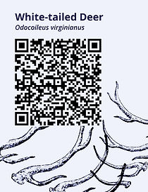
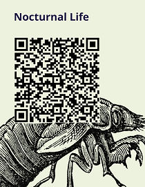
The purpose of this project was to design a way for people who walk in Forest Hill Cemetery in Fredonia, NY to digitally interact with the natural elements. In order to make this work, there would be QR code signs placed at different points throughout the cemetery that would correspond to twelve different species (Cucumber Magnolia, Tulip Tree, Eastern Hemlock, Moths and Butterflies, Blue Jays and Crows, Chickadees, Titmice, and Nuthatches, Nocturnal Life, White-tailed Deer, Carolina Wren, Cooper's Hawk, Black Cherry, and Shagbark Hickory) in the cemetery. The goal is to provide short but informative pieces of writing on each species as well as other species that interact with them in the cemetery and have accompanying visuals that would show users what to look for. At the end of the project I had 12 QR code sign designs, 12 app page designs as well as a table of contents and references page that are all in a functioning prototype, and a few mocked up images of the app and the signs in their environment in the cemetery.
Background Research
The first part of my research involved finding other places that had implemented similar projects. For this I visited the Roger Tory Peterson Institute in Jamestown who I knew had a QR code trail. I then visited the cemetery itself to try and find some species to document. Having been there many times before, I had a general idea on what I would find, but I was able to add a few species to the list as I found some insects and plants that I hadn't seen there before.
I also took a walk around the cemetery and dropped google map points for locations where I thought the QR code signs would work best. I compiled this into a project for future reference.
The bulk of my research was done as I research each species using a variety of sources both print and online. It was important that I limit the information down to short bits so that the webpages wouldn't be too lengthy and so someone might actually want to take a little bit of their time to read it.


As I walked in the cemetery, I took pictures of everything and uploaded them to an app called iNaturalist. This not only allowed people experienced in IDs to ID my images to confirm I had them correct, but it also marks them as a GPS point on a map within the app. I referenced this many times on my return trips to find the spot that I was observing each species.
Discussion of Concept
My intention is to capture the attention of people who already use the cemetery as a place to walk. There is a lot of natural history in the cemetery which include multiple species of old growth trees and many areas that are good for migrating and nesting birds and mammals. Though a lot of people walk in the cemetery, many of them may not know the specific names of the species that they undoubtedly encounter.
Most people today carry a smart phone with them. Using that technology to provide knowledge of the natural world was a main goal of this project. Along with being a tool to learn the cemetery, this app could easily be adapted for any other outdoor space where people frequently walk.
I chose to highlight a vast range of species from trees and plants to birds to mammals and insects. Some of these species like Opossums and Raccoons, Little Brown Bats, and bugs like Cicadas, and Crows have a negative reputation. In my information on the app pages, I tried to highlight the importance of these animals to the ecosystem. I also chose to discuss Eastern Hemlocks and along with that the Wooly Hemlock Adelgid which is threatening Hemlock trees. I included a link on that page for more information on how to recognize and report instances of it to the DEC,
Along with providing knowledge on species, I also wanted to encourage people to be more ethical and aware members of the natural world.
Thumbnails and Roughs


Critique Notes
During the first critique, I showed rough ideas for my layouts. I got feedback to test out some different variations of the color palette to see what would work best with the text color. I did end up doing this and darkening the shades a little more so they would work with both white or black text. In my original roughs I also had my watercolor illustrations. It was suggested that I look into alternate visuals which I did in order to save myself time and so I could make it more cohesive. In the final critique I had the suggestions to try including animated gifs or links to migration maps. I also had the suggestion to change the type on the Chickadees, Titmice, and Nuthatches button on the species guide page to make it look more like the other titles. I did change the size of that for my final. For my visualizations I had the suggestion to use Photoshop and take out the original sign text and then use the multiply setting to get the QR code to look more like it was on the sign.
Development of Visuals
When designing for digital media, it is important that typefaces are easily readable on a phone screen. I did some research and found that Montserrat, Helvetica, and Open Sans are all good typefaces for digital media. Next, I thought about color and how I could use it to add to the meaning of the project. I decided to code the different species by season, three for each season, with orange as fall, pink or red as spring, green as summer, and blue as fall. This mainly follows the foliage and flowering changes to plants as they go through the seasons.
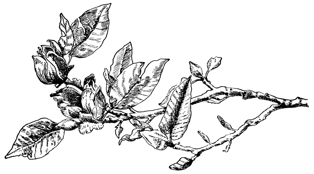
At first I was looking at using some of my own watercolor illustrations as seen above in my roughs for the layouts. I decided that the style didn't integrate well digitally and chose to use images from Clipart ETC instead. There was a wide variety of illustrations to choose from all in black and white in what seemed to be either prints or pen drawings. From there I decided to add some color to the illustrations to draw more attention to them and increases specificity. For several of the compositions, I combined illustrations together in order to create a new scene such as the Grackle standing on a Cucumber Magnolia branch.


Design Elements
One Gestalt principle used was similarity. This was used in the color coding of each page of the app. There were three for each color and this corresponds to seasons. On each page, the line art was also the same color as the background for the upper title. I used images of each species which could be considered icons, but I also used some images as indexes such as the next for the Carolina Wren and the antlers for the deer. These are things that we know to associate with the actual subject through learned context. I also used a common grid throughout the entire app so that everything would remain consistent and organized. There is also a hierarchy with the names of each species at the top in a larger font size and the rest of the information in a smaller point size. I tried to engage the negative space by arranging elements in ways that used the space in between text but also related back to the text blocks themselves. For example, on the Carolina Wren page the image of the Carolina wren forms almost a right angle against the corner of the text block.


Narrative Analysis
Through this project I learned a lot about designing for digital media. This was the first time I’ve used the prototype feature in Figma and it was much easier to figure out than I had anticipated. There were a few challenges with trying to figure out how to link up the audio, but I found a way to work around it by linking the source of the audio rather than trying to embed a file. During this project I also made use of illustrations that were not my own. In the past I have almost always relied on my own illustrations but I think it was helpful for me to branch away from that for this project so I could focus more on the design and interactivity of a medium that was new to me instead of taking on the task of designing and illustrating within the time frame. Continuing this project, I would like to add animated GIFs. I would also like to get better recordings of the bird sounds I recorded.
The most enjoyable part of the process for this project was actually going to the cemetery and doing research there on what kind of species were around. Although I do go there a lot, I never really get the chance to take as much time as I want and just look closely at what’s there. I found so many different leaves, insect skins and hives, nests, and seeds and nuts that I had never even seen before. There was an entire section of Common Milkweed at one part of the cemetery that I had never noticed and I ended up being able to incorporate that into one of the pages of the app. I think the illustrations that I used were also successful. It took a lot of time to find ones that would work well with my content and I sometimes had to search the site with alternate names for the species in order to find the proper results. Though I would like to illustrate these species myself, I think using the images from the clipart site was a good solution given the time constraints.
Overall, I learned about typefaces to use for digital media, how to mockup and visualize, and how to take advantage of the interactivity that can be used in the digital world. Moving forward I would like to do some more web based projects to strengthen my skills and build confidence in working this way.