Packaging Project- Benadryl

Project Statement
The purpose of this project was to design for a three dimensional space using both visual and typographic elements. During this project it was also important to design within certain constraints such as following the guidelines for the drug facts. Throughout this project, we also learned some different approaches to creating a good design brief. Thinking about audience was important in making design decisions for the two packages. The end result was a clean, physical box that would be constructed so that the edges were not visible and all pars worked how they were supposed to. Images were taken of the boxes and these images were then edited so that any imperfections on the boxes were no longer showing.
Background Research
The research for this project consisted of several readings on the design brief including Creating the Perfect Design Brief by Peter L. Phillips and a section on design briefs from Research for Designers by Gjoko Muratovski. I also read a section from Packaging Design by Marianne Rosner Klimchuk and Sandra A. Krasovec.
Along with the readings, I also found an interesting package and then analyzed that package for different elements of packaging. This was done collaboratively using what we learned from the packaging design reading.
In preparation for the construction of the actual box, I also built a practice box.

Discussion of Concept
My intention with the design of these two boxes was to make them similar enough so that they would work as a system, but add certain elements into each that would communicate the audience. For example, while the adult Benadryl is more simple and only features flat colors and typographic elements, there are some simple visuals on the children's version that make it appear more fun. The flowers on the top of the box and the grape indicating flavor are very simplified so that it still works within the system.
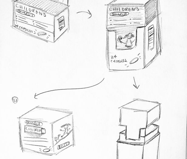
On the children's box, the design of the structure of the box itself is the same, but when you lift the top it reveals another image of a simplified cluster of flowers. I wanted to add this interactive element as a way to add something into that package that may capture a child's attention. As the parent may be giving the child the Benadryl, the child may play with the box and be interested in that visual element.
The target audience for the adult Benadryl is allergy sufferers who may already be familiar with the Benadryl brand and who find it reliable. For the children's Benadryl the target audience is parents of children who may need allergy medicine. I want this audience to look at the package and be reassured and clear on what they are getting.


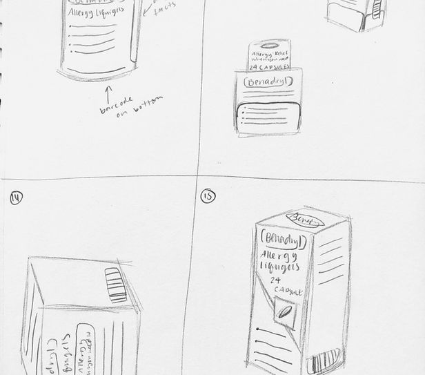
Thumbnails
Refined Thumbnails
Roughs


Final Images
For my final images, I took pictures with a lighting setup using my DSLR camera. I then took those images into Adobe Photoshop to clean up any imperfections in the boxes.
I decided to photograph them together as a system because it shows how the elements on both boxes work together.


Critique Notes
In the first small group critique, we went through my thumbnails and chose some directions to further develop. One suggestion that was brought up was questioning whether I needed the Benadryl logo on the top and front of the box or if that would be too repetitive. Ultimately, I decided to remove the logo from the top of the box since a buyer would likely not see that when it is on a shelf.
In another critique it was pointed out that I had a lot of information crammed in the space and that my Drug Facts may not be following the set guidelines. I went back and changed the Drug Facts and then moved the bar code from the side to the bottom of the box. This gave me more room on the sides for other elements and would also make the box easier to scan.
Another change from my rough to my final is the placement of flowers. Initially I only had them on three of the top sides and the top, but after a comment, I decided to include them wrapping on the front panel of the top of the box as well. I think this ties the information in well with the visual elements.
A small typographic change I was suggested was to change the typesetting of the Spanish words on the front of the children's box. Originally I had them offset, but after adjustments I made them align with the English so it was easier to understand that these were direct translations and not additional bullet points. Another typographic change I made was the alignment of the logo. Originally I had the text aligned to the edge of the oval of the logo, but I changed it to align with the B of Benadryl.
Design Elements
One design element I used was hierarchy. On the children's package, I made sure the 20 chewable tablets was larger than the other text because that information is important to parents needing to buy this medicine for their children. Typographically, the Spanish text is smaller and italicized because it is likely that most buyers will be reading the English. I still made sure to use a large enough font so that the Spanish readers would be able to get the information as well.
The colors between both boxes is used as a unifying factor. the blue used for the adult package's lid is used as the lower part of the children's and vice versa with the pink. Overall I mainly used white text on both boxes with the same blue being used as an emphasis. The blues and purples of the flowers on the children's box are taken from the same purple as the grapes.
Narrative Analysis
Going into this project I was not very confident with my skills for designing on a three dimensional surface. I had only ever created a design for one other object like this before. One of the main things that helped was practicing contracting the boxes. Even the practice box that would not be my final form was helpful in teaching me how precise I needed to be and how much time it can take to cut and assemble a box structure. When I did begin to figure out how to construct the form that would be my box, I initially added way too many flaps. In the next few versions I refined it down until it was the most concise use of paper. When constructing my final form, I ran into some issues with getting the paper to fold nicely without tearing. For the most part, I am happy with how clean the final form came out, but there are some imperfections such as unclean edges that I wish I could have avoided.
With the actual designing of the box, I learned how much space it takes to have all of the elements meet the guidelines. There really is no point in beginning to add other elements until those drug facts and directions are properly formatted and in their places. The best way to make the package interesting was through typographic choices such as color changes and bolding. Figuring out how to get the two boxes to work well as a system was also a struggle for me in the beginning. Originally I had wildly different shapes for the boxes. I realized that the best way to get them to fit as a pair was to keep the same basic structure and layout and to add in other elements that would fit well with the children's audience.
Learning the lifting configuration and angles that would work best for taking good pictures of my boxes was also something I did in this project. After my initial images came out at low resolution with dark lighting, I had to retake my pictures. I had to make sure the natural lighting would be right and then created a clean white backdrop that would reflect the light properly. I tried a few different ways of arranging my boxes and ended up photographing them together as a system. I learned how to clean these images up in Photoshop mainly using the spot healing tool and the cutting tool to cut parts of the box and use that to fill in areas where there were cracks in the folds.
Overall, I had never really payed much attention to packaging before this project. It is now more clear to see all of the elements that are working together on packages in order to make them interesting and visually engaging and enticing for buyers.
IP Report
Typefaces:
PT Sans Regular, Alexandra Korolkova, 2009.
PT Sans Italic, Alexandra Korolkova, 2009.
PT Sans Bold, Alexandra Korolkova, 2009.
Image:
“Home.” BENADRYL®. Accessed May 15, 2022. https://www.benadryl.com/.
Research:
Phillips, Peter L. “1,3.” Essay. In Creating the Perfect Design Brief: How to Manage Design for Strategic Advantage. New York: Allworth, 2012.
Muratovski, Gjoko. “Design Brief.” Essay. In Research for Designers. Sage Publications, 2016.
Klimchuk, Marianne, and Sandra Krasovec. “Elements of the Packaging Design.” Essay. In Packaging Design: Successful Product Branding from Concept to Shelf, 2nd Edition. John Wiley & Sons, 2013.


